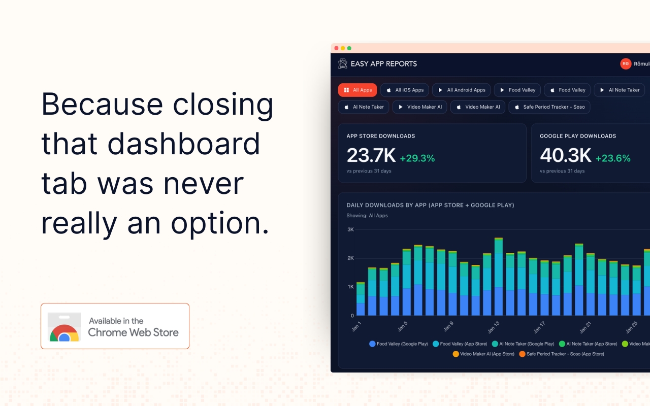
AppTab: Your App Data, Right There When You Open a Tab
AppTab is a Chrome extension that surfaces your App Store and Play Store data directly in Chrome's new tab page.
April 20, 2026
New Features
Deep Dive into Apple's Subscription Reports
.png)
Have you ever wondered how Apple's subscription reports could be the driving force behind your app's success on the App Store? In our recent YouTube live session held on April 2nd, Rômulo Gomes, our founder, we delved into a plethora of essential topics, diving deep into the App Store's subscription reports.
From dissecting Subscription Events, Subscribers, and Subscriptions, all through the lens of Easy App Reports, to understanding nuances like differentiating between new and renewed subscriptions and grasping the concept of Lifetime Value (LTV), each discussion provided invaluable insights into leveraging Apple's subscription reports effectively.
Want to learn more? Watch the full video for a comprehensive immersion into Apple's subscription reports: Link to the video
Now, check out the transcript of the video below:
Hello, hello. How is it going? Good afternoon, I think, for most people. Maybe not for everybody. Some people are in Brazil. Hello, hello. Let's join. Let's get this thing started. We have a full hour, so let's try to make the most out of it. Yeah, I'm getting some messages here. Good, good. So before we wait for everybody to join, let me just say hello. I'm Romulo Gomez. I'm the founder of Easy Upper Parts. And we're doing this series of lives to... build publicly publicly some of the dashboards that we offer to our customers in the form of templates so for example templates for apps optimization or just to measure growth in general ratings reviews all of that in the last four episodes that we had which by the way you can find here in our channel I built this the giga dashboard that I'm about to show you and next week we're going to start working on that template again and the idea is to add uh revenue information basically so revenue proceeds and also sales subscriptions so you can see like new subscriptions renew subscriptions cancellations um You cannot see your sales by billing cycles. Like, for example, how many weekly, monthly, yearly subscriptions am I selling? And am I selling more like weekly now versus yearly? And then, of course, the actual proceeds. So we want to see all of that within one dashboard. But there is one thing because, you know, Apple and Google they share that information in very different ways. So for Google Play, it's more straightforward. We're going to do a separate episode talking about that. But on Google, basically, you do have this, they call this earnings report, where you can see all your sales by, by in-app purchase, basically. It's kind of straightforward. You see the products, you see how much customers are paying for it, you see how many constellations, and then you can see that on your own currency. So, for example, if I'm an app company from the US, then I'm going to see all my revenue in dollars. If I'm in Europe, I'm going to see euros and so on. But for the App Store, it's different. So that's kind of the point for today. Because first, with the App Store, we have multiple tables with different information. So we're going to explore those tables today. Let me start by showing you exactly that. So let me open my mind map.
So as you can see, within the App Store API, we have different, they call it reports, right? So you have sales and trends, which is kind of the old report from Apple. You have the analytics report, which is new. We are implementing this now, by the way, probably launching this I still on on this week which is very very good news of course we're going to do a different episode and a new template uh with this alone but for today this is what we want to explore so it's the subscription reports and we have three so we have one table with your subscribers so that's interesting right so we can see on a user level uh how many sales you are having so that's cool so let's explore that I think especially now in the times of scan this is uh very very interesting then we also have uh these tables which is called subscriptions uh but this is not subscription sales so this is the subscriptions yourself so all the products so let's say you have like uh three different plans and then within those plans you have like yearly monthly weekly for example so those are all different So this is what this is about. And then we have subscription events. And this is actually the thing that I think most people are interested in. Because within events, you have, for example, new subscriptions. You have renewals. You have cancellations. You have retries. You have a bunch of things. We're going to explore some of these events today. Yeah, so it's interesting that you don't have all this data together in one table. And that has its pros and cons. It means that, for example, you can go very deep here and see individual IDs here. You don't have names. You don't know who those users are. But you know that this is a different user, basically. whereas here then you have actual data on proceeds and revenue for example and then here you have the event so let's explore it and hopefully you can also find a way to kind of merge these tables so we can have everything together basically so Let's get started by just having a quick look at the schema. So if you don't know what a schema is, it's basically a documentation explaining what is contained in those reports, basically.
So I'm going to go to the wiki from Apple itself. And as you can see here, you have the subscription events. As you can see, there's a bunch of them. We're not going to go through each one, because it gets a lot. So for example, for activations, you can have people that just subscribe. You can have people with an introductory offer. So for example, when you pay $1 first, and then you start paying $5 the next month or the next week, that's an intro offer. You can also have a marketing bonus period. You can have an offer code. So this is all different ways of saying that, someone subscribed to your product basically and then same thing so you have different cancellations and then you can also have conversions to standard prices like for example if you buy an intro offer And then you continue paying, then you are switched from an intro offer to a standard price subscription. So there's all of that. And then if you scroll down this page, you are going to see that there are a lot of events. So from reactivations, bidding retries, renewals, refunds, So that's why sometimes it can be confusing or even hard to build a dashboard because there are a lot of things that you can look into. So for today, of course, we're going to try to simplify and just get the basics. So this is subscription events, but let's look at the report itself. So for example, here on this table, We have all of those events that we just talked, so subscriptions, cancellations, renewals, et cetera. You can see from which app, what's the ID of the parent app, the name of the subscription. Yeah, if you have a family ID, then you have this field. Probably you don't. This is interesting. So what's the standard subscription duration? Again, weekly, monthly, bi-monthly, yearly, et cetera. the offer type. So a lot of people ask us, for example, oh, can I distinguish free trials from people who actually paid? So with this field, you are able to do that, basically.
So see how specific that is, right? You have to go into the table. Then you have to read it and see, oh, OK, so if I want to distinguish this, I have to use this field. So we can either have it on a table or maybe add a filter, basically. And so on. I'm not going to read all of them because it gets a lot. Just the most interesting ones. So you can see the promotional offer. You can see how many consecutive paid periods. So if you're trying to get an idea of your lifetime value, this is super interesting. The device, the state, which is very interesting, the country. If your customer changed their subscription, you can see the previous one, cancellation reasons, quantity, et cetera. So that's subscriptions, subscription events, sorry. So this is kind of the things that happen with the subscription itself. So it can either subscribe, cancel, renew, basically. But let's now look at the subscription report. So that's more about, again, it's not the user subscriptions, more like your subscription as a product, basically. So as you can see here, you can see, okay, what was the retail price of this subscription? What was the currency that the customer paid? So again, that's the main difference between Apple and Google and how they organize their data about revenue is that they're always going to give you your sales and proceeds on the original currency of the customer. So if you're selling an app worldwide, that's kind of a headache because then you're going to have like a hundred different currencies and then you have to do some calculations to translate this to dollars or euros or whatever is the currency that you're using. So again, a lot about the transaction itself. You can see how many active subscriptions you have on trial versus pay up front, pay as you go, promotional offer. So this is also interesting, I'd say, to see the share between those subscriptions. Are you selling more free trials? Then pay as you go or pay upfront. That's interesting, especially if you are doing some A-B testing to see what works best. I think maybe having kind of a area chart with those changes over time, that can be very interesting. Okay, so that's an idea. Bidding retries, grace periods, offer codes again. Then how many subscribers okay that includes family members okay interesting so this field is only populated when the record represents more than three subscriptions that's interesting good okay so this is where the revenue is right on the subscription report on the subscriber report in the other hand we're going to have information about the subscribers itself so now it's really about the users so you see that some of the fields are the same so you could uh connect this table there and then let's see here yeah again so the procedure so that's easy so you could see how much money you are making on a user level so that that's really cool what else a device country same things okay so this So Apple provides a randomly generated subscriber ID that's unique to each customer and developer. So this field will be new when a customer requests a refund after six months. Okay, so if you have news, it's because it's people who asked for a refund, basically. And we should do reset. Okay, so if, yeah, it's about other people who asked for a refund, basically. Units okay so how many units are they bought uh and then how much money is going to be here on the proceeds and it proceeds for each item delivered proceeds reason is how you distinguish um subscriptions that were active for longer than a year because then you pay less uh in the fees for the app store basically. That's cool okay that's very interesting but let's organize all that so I prepared uh some notes so you can use for today so the goal is to extract revenue and our proceeds I'm not sure if we can get both so let's see what we can do I also want to see interesting dimensions like for example I want to see how many sales are making per billing cycle like yearly versus monthly for example Free trials versus payer-prone, cancellation reasons.
So see how specific that is, right? You have to go into the table. Then you have to read it and see, oh, OK, so if I want to distinguish this, I have to use this field. So we can either have it on a table or maybe add a filter, basically. and so on. I'm not going to read all of them because it gets a lot. Just the most interesting ones. So you can see the promotional offer. You can see how many consecutive paid periods. So if you're trying to get an idea of your lifetime value, this is super interesting. The device, the state, which is very interesting, the country. If your customer changed their subscription, you can see the previous one. cancellation reasons, quantity, et cetera. So that's subscriptions, subscription events, sorry. So this is kind of the things that happen with the subscription itself. So it can either subscribe, cancel, renew, basically. But let's now look at the subscription report. So that's more about, again, it's not the user subscriptions, more like your subscription as a product, basically. So as you can see here, you can see, okay, what was the retail price of this subscription? What was the currency that the customer paid? So again, that's the main difference between Apple and Google and how they organize their data about revenue is that they're always going to give you your sales and proceeds on the original currency of the customer. So if you're selling an app worldwide, that's kind of a headache because then you're going to have like a hundred different currencies and then you have to do some calculations to translate this to dollars or euros or whatever is the currency that you're using. So again, a lot about the transaction itself. You can see how many active subscriptions you have on trial versus pay up front, pay as you go, promotional offer. So this is also interesting, I'd say, to see the share between those subscriptions. Are you selling more free trials? then pay as you go or pay upfront. That's interesting, especially if you are doing some A-B testing to see what works best. I think maybe having kind of a area chart with those changes over time, that can be very interesting. Okay, so that's an idea. Bidding retries, grace periods, offer codes again. then how many subscribers okay that includes family members okay interesting so this field is only populated when the record represents more than three subscriptions that's interesting good okay so this is where the revenue is right on the subscription report on the subscriber report in the other hand we're going to have information about the subscribers itself so now it's really about the users so you see that some of the fields are the same so you could uh connect this table there and then let's see here yeah again so the procedure so that's easy so you could see how much money you are making on a user level so that that's really cool what else a device country same things okay so this So Apple provides a randomly generated subscriber ID that's unique to each customer and developer. So this field will be new when a customer requests a refund after six months. Okay, so if you have news, it's because it's people who asked for a refund, basically. And we should do reset. Okay, so if, yeah, it's about other people who asked for a refund, basically. units okay so how many units are they bought uh and then how much money is going to be here on the proceeds and it proceeds for each item delivered proceeds reason is how you distinguish um subscriptions that were active for longer than a year because then you pay less uh in the fees for the app store basically that's cool okay that's very interesting but let's organize all that so I prepared uh some notes so you can use for today so the goal is to extract revenue and our proceeds I'm not sure if we can get both so let's see what we can do I also want to see interesting dimensions like for example I want to see how many sales are making per billing cycle like yearly versus monthly for example Free trials versus payer-prone, cancellation reasons. What else? Maybe there are more things that we can find. And I think the biggest question is how close can we get to transaction level or user level data? That's a big one. So what we're going to do is that we're going to look at the documentation like we already did. And the next step now is to explore this on Looker Studio. And I also want to have kind of a summary with all the learnings that we got from today.
So I already prepared a table. And I think we can already fill this because we already know some stuff. So for example, subscribers and subscriptions. So you can use it for... I would say, so it's revenue proceeds. Same thing here. And then here, this is about the section. So for me, the way I'm thinking about this now is that subscription events, we have other transactions. So that's what Apple's calling an event, because that's, again, subscribing, canceling, et cetera. So let's say yes here, but no there. So we have transaction-level data here, but not user-level data and so on.
So this will be the opposite, right? Do we have user-level data on the subscription report? No, no, no. So subscriptions is just like, it's about again. So if you think about our subscriptions as a product, this is what this table is about. Then here about this. Then here it's all about each event, which we can think as a transaction. Let me just see something. Because also something that I notice here is that there is no date. Yeah, there is no date. So on the subscription report, there is no date. So the information here is kind of a snapshot about all your subscriptions for your full history, basically. Here we do have the event date. I think I saw another date, original start date. So this is interesting. So we have two dates here. So one is when the customer actually subscribes and then the other is when an event happened, which is again, a refund, cancellation, et cetera. On the subscriber report, we also have the event date. Okay, okay. But we don't have the event itself. No, we don't. No, no interesting. This is very, very interesting. So probably something that we could do is to join those tables. I'm not going to do this today, by the way, because this is just technical work. I don't want to hold you for that long. But we could probably use this field to join these tables and then have all this data together, basically. OK. Good. Proceeds are the user's currency. Do we also have... What's the limitation here? There's no revenue figures. Interesting. okay so if I want revenue probably I want this if I want the number of sales like how many new versus renewals I had last month then I guess this so that's kind of the logic that you have to follow now interesting okay so We already know. We don't have to type this again. Good, good. So now let's go to our dashboard. So by the way, if you're seeing this and you've never seen App Store data flowing directly to Looker Studio before, just head towards easyappreparts.com.
You can see all the integrations that we have. how to connect, how to sign up. Basically, you just have to be an admin on the App Store or Google Play, or maybe someone at your company or your client. You just have to set up these API keys, and then you're connected once and for life, basically. And then from there, you can build those dashboards. You can build yourself on your own, or you can use our dashboards like this one. So this is the one that I built on the last live. So for example, here, We have this nice overview with our acquisition metrics, stock performance, hygiene metrics with ratings, reviews, crashes, et cetera. Then as you can see here, we have a lot from installs, reviews, again, trends with your sources, your product pages, traffic per country, whatever. It's all available here. Let me just, it is here to date. So basically you can really control the data that you have from the app store. I think that the cool thing is that people are always looking into a specific thing. So for example, if I'm running ASO that I only want to see my organic traffic. And maybe I'm also focusing on specific markets. So what I could also do is to only check my App Store search and App Store browse traffic, and then filter this by, I don't know, Canada, because that's the market that I'm focusing on at the moment. And then it's really yours. And every day, you don't have to go to the App Store and to Google Play and do like 100 filters to find what you need. They'll just open this, and you see what you need. So everything is customizable. just drag and drop and change this metrics. So yeah, if you want to can just then sign up on easyupperparts.com. Good, good, good, good. So let's go back to our subscription. So I prepared this, which is basically just a dump.
So I got my subscriptions table here. So as we said, What's interesting here is that on subscriptions, I can see the subscriptions itself. So in this case, my app is very small, so I only have one. But probably you, you have multiple products, like multiple subscriptions, and then you also have multiple billing cycles, weekly, monthly, and so on. So you'll be able to list all of that here. I'm also having a look at, OK, how many active subscriptions I had. Now we're going to go deep into that and then the subscribers. So again, you see the subscriber ID. So this is the random ID that Apple is providing us. So these are all my customers, basically all 84 of them. Then here I could see, let's say that this customer I don't know, let's see, USD is better. So this customer is paying in dollars. He bought 13 units, so probably he paid 13 times of all subscription plus all the renewals. And then we made $27 from him. And then here you can see the thing that I was talking about revenue-wise. So as you can see, Apple is going to provide you data on a currency level, which is cool, because then, for example, if I filter for Brazil, that I know that there is Brazilian reais, so that's easy for me to understand. But then kind of the challenge as well is that if I want to sum all of this, this will not make sense because I can't sum dollars with euros, right? That wouldn't make sense. That's kind of the challenge that we are going to have.
The other thing is the subscription events, like we said. I only have eight because, again, I'm running a very small app. But probably you have more, especially if you're running promo codes and you're trying to rescue current customers, all of that. Then you're going to have many, many more events here on the left side. And here I could see, let's remove this. how many events I had. So for example, for 2024, let me change this. I'm going to do advanced. Let's do all time, like the last three years for me in this case. Okay, so in three years I had 59 subscriptions, not a lot, 453 renewals, that's interesting, only two reactivations, four cancellations from BillionRetry, 38 renewals from BillionRetry. So BillionRetry is when a payment fails and then there's a grace period like two five uh 17 days and then apples apple tries to charge that customer again so in this case we had 38 successful from that and for not successful and then the subscription is automatically canceled so not all chart is voluntary sometimes people they just have don't have the money on the credit card and they get canceled automatically, basically. So you can all see here how many cancellations I had, how many refunds, et cetera. Okay. Let me just show you something. So from here, we could change things or add things. So for example, if I want to see, oh, what's a state? Okay, New York, Ohio. Okay, so this is really state, state. Let's get something else. Let's get this. Seven days. So that's the standard subscription duration that I have for my app. Again, if you have multiple products, probably you're going to have a bunch of those because each product is going to have a different standard duration. Let me see what else we have. And by the way, you can add this thing up. So if you want to see only renewals, only cancellations, only subscriptions for my seven days product versus my monthly product, you can do that. Let's now, let's bring the cancellation reason. There's not a lot of data because this app is very small. I only had to, so I had five cancellations due to billing issues and 56 of people who just canceled and they didn't state a reason, basically the rest. It's probably not a cancellation then. Good. What else? We have the device. We have the country. So if I want to see the cancellation reason per country, let's not do that. So if I want to see my top countries here, you see US, Brazil, Canada, and so on. So that's already interesting, right? I could also sort this by date and see this by day, week, month, for example. Okay, there's a lot more. Let's not dig into everything. I just wanted to show you that you can do this. So for example, here, you can see all the fields that are available here, and then the same with the subscriptions. We have all these nice fields with distinction between pay-as-you-go versus pay-up-front versus trial. It is really, really nice. Okay, so let's build something. So you said that we want to have revenue or proceeds. That's more difficult, interesting dimensions, but I think also the basics, right? Sales per week or month and then also new versus renewals versus cancellations I think that's also pretty interesting we can even start here so let's go so what I'm gonna do now I'm just going to duplicate this so I don't lose this thing duplicate nice I'm going to use, there's not revenue yet. So we're going to go with subscription events. So the first thing, I'm going to leave this by the way. It's kind of a trick. If you don't know your stuff by heart, just have a table with no metric. And then you're going to see the list of other dimensions included. So for example, if I bring the country, then now I have both. What you could do, for example, is to have them separate. For example, now I want to have, let's say, the country. So I can see now the list of countries basically that I had sales and this, let me remove this. Nice, nice, good. So what I'm going to do here is that I like to start with a table. and then build stuff from there, basically. I want to bring a dropdown list. The first thing that I'm going to do is just a simple chart with all my subscriptions, basically. So this filter is going to be the event itself. So here, there you have a subscribe. If you want to lock this, by the way, just put the value here. And now there we go. But now I want to have the quantity. So how many subscriptions did you say? Okay, 59. Now, awesome. Good. Let's remove this. And now the final touch, let's add the event date. actually original yeah so see it's the same because subscribe is only the first action it doesn't count all the renewals so I want to see when people sign up so this is kind of uh subscriptions, and then refresh. I don't have a lot, by the way. No, that's not it. Okay, I can just do this later. Nice. So I wanna do two things now. I want to have a chart and I want to have a scorecard. So it's easier if you do the table like I did, and then you just come here, time series and now I'm going to have a nice nice chart I don't have that much data okay so let me just so one year from now cute and then the breakdown is the date. Problem is that we don't have a lot of transactions.
So that's kind of the issue. Don't break down. Yeah, so it looks ugly because basically this app doesn't have a lot of sales. What I can do here, that instead of date, I can use week. If it's weekly, it's better. When does the date start? September 23, so let's also do that. Let's see. Nice. Later we can customize this so it's more pleasant to the eye, basically. Here. What we can do is maybe add the country just to make this interesting. We order by quantity and then we don't want the date because we already have it. So there I have it. So these are all my subscriptions per week since September last year. Then here, I also have the countries basically. So you can see the US is by far the leader here. Nice. And then I said, if you want a summary, we just come here, do a time series, sorry, scorecard. And there you have it. What we could do, I'm thinking, so this is all just new subscriptions. Right? It's a bit slow. So what we can do to answer these questions is to have these little boxes on the top with all of that.
So let's start with new subscriptions. So the thing is that we have this filter now, right? Instead of doing this, I'm going to create a filter. So I from Apple only subscriptions include event contains subscribe starts with safer. Nice. And here we're going to actually remove this now. Let's add this filter here. Good. So this is only new. By the way, what we can also do to make this interesting visually is to fill, and then I'm going to use the colors that we're already using at this dashboard. So these are new subscriptions. I also want to see renewals and cancellations. So let's go back to our documentation. By the way, you can find this on wiki.easyhelperparts.com. So let's go to SubtractPrilEvents. I also have to consider these cases. Let's see. Reactivation, not really refund. Renewal. Wow, I have a bunch of them. We have a bunch. Let's see here. This is the category. OK, so let's just go for Renew. So I'm going to create a new fitter. Include event Renew. That's it, right? Renew, yes. Now we have to rename this. Renew. Nice. And then the next one is going to be the constellations. Same thing. Let's come here. 45, okay. What else? Do we want to have the other things? I mean, maybe reactivations. I think reactivation is interesting as well. So let's have that. Include only. Deactivate. Deactivate. Sorry. Am I missing a letter? Oh, OK. That's why. Only two cancellations. Even better. Good, good, good. Okay, then we can give it different colors. Maybe just, if you want to make this more interesting, maybe this, because it's a constellation, you want to say that this is red, right? This is stronger red. And this is... Good, this is reactivations and then... Yeah, maybe again, same thing. If you want to, you can change the colors then. Nice, so I can already distinguish this new versus renew, but maybe I want to have it here as well. So what I can do, I'm going to do that thing again. But I'm going to group this. Just refresh. So here I want to see all the chart. I want to see neo versus renewals. That's something that a lot of people like to see. So let's pick event. Nice. And then if we pick subscriptions and renewals. Good. I like this here because then you can see what's exactly the filter that's being used. Is this here? I never know. Box is white. OK. What we can also do to make the life of the person who's going to use this a bit easier is to put country here. But no, yeah. You could also filter, let's say, if I only want to see US, it's only US. But before that, there's one change I want to do here. So let's go with this thing. Then I want to break down by event I already did okay nice because so this is what I want to see visually I want to see how many new subscriptions versus renewals my app is is selling and that's what I see here right I can even then play with the colors use the same the same thing so everything matches I'll have to pick. I think I'm not going to do that. But if you wanted, you could just come here and then pick the color for each dimension to align the color so it's easier to read, basically. Just the one. So you'll see. Subscribe. I could go with this color. Let's say for the renewals, I go with this. It's just similar. Maybe this one. And then same thing here. Okay, so now it's aligned. Let me just change this. It's going to be like yellow. Good, good, good. So so now you can see it basically so new subscriptions renewal subscriptions reactivations and constellations so all in one place uh kind of easy what you what you could do then is maybe you want to have specific view of the renewal specific view of constellations and then you see that over time you see this by like country you see again I only have one app, one product. Maybe you have multiple apps, multiple products, and then want to also compare the product that you had last year with a new one that you launched this year. So you could also very easily do this too. Just get the water now. Nice. managed to get this. No, sorry. This and this is done.
Let's get the proceeds. Proceed. So same logic here, but we said that reviews is available like here. Let's use this one because this has no date. So this will be a problem, right? So let's, So this is subscriptions. Let's get now subscribers instead. So I just changed the data source of these changes on where I'm getting this data from. And I wanna have units. I wanna have the developer proceeds. I want to have the customer currency. now I know how many sales I had where proceeds do I also need something else so I could put the subscription name for example you see I only have weekly and then let's order this by units so I want to see on the top the countries where I sold, sorry, the combination of currency and proceeds where I sold the most. Could also be country, by the way, instead of the currency. If you put it here, then you can see, yes, usually pretty much aligned, right? US, US, Canada, Brazil, Australia, and so on, Japan.
We don't have to use this. Good. Of course, we have a problem here. I mean, it is possible to translate this. I'm wondering if I should do it live. I don't think so because we're almost out of time. So for this episode, I think I'm going to leave the proceeds on a chart like this one. So we see over time how much revenue we're making. And then I'm also going to have the scorecard with the total amount. And then I'm going to leave a warning to say, hey, this is not multiplied by the right currency. And then we can fix that when I build actually the dashboard next week. So let's do that. So again, first thing is, do I want to proceed? Yes. So I'm going to remove, actually put this here, this here. Yeah, that's better. That is better. It's a bit misleading because some currencies, they are inflated. So what we could do is to align this by, see, I have a huge spike here. I will have like one currency with a crazy amount. And now we have this, which is really unfortunate. So you see it's this one. So I could filter this from my report. Just remove this. Yeah. Nice. Now I have the same thing. So I'm going to just of copy-based, the same structure. So I'm going to do the same, basically, that I did on the top, which is I want to have these figures by week, basically, just so it's aligned. So the event date here. to have EZO year week. So if you want this by month, by quarter, by year, just do this. Come here on the data type. and then pick your model. So you can do even like the name of the day of the week or the day of the month. And then if you look at this on a year, you see, okay, what are the days of the week with the most sales, for example. So you could do that. But I'm going to use iso-year-week basically. And then again, just to make this aligned, I would go with this one. I could also show the data labels. Not going to do this, but I know you could do that if you wanted. And then I'm also, I don't like these lines too much. I'm just going to make them almost transparent. let's just align stuff this filter goes here good so now we have our subscription loss sorry so this is uh seats it's something that I'm doing more and more by the way is for example We can do something like this. Proceeds. And then you go to the documentation and say, oh, proceeds. What's a proceed? Proceeds for each item. It's not very specific, I would say. But you get the idea, right? So if you want to make your dashboards more clear, like maybe people don't know. Let's get a better definition. Let's do this instead. This is nice. Because a lot of people don't know what a proceed is. So this is the revenue after all the taxes and everything. It's kind of a net profit of your app. So let's just make this smaller. Can we make it like this? No, we can't. OK.
Now there I have it. So people, when they open the dashboard, if they don't know what's a proceed, it's like, okay, I'm sorry. Proceeds refer to the amount of money app developers make from selling their apps on the app store, calculated by subtracting applicable taxes and Apple's commission from the consumer price. So that's what a proceed is. Let's just remove this. And now what I'm gonna do just to finalize, Then we can wrap it up this episode is that I want to have a scorecard with my actual proceeds. Wow, this looks incredible. Almost, let's speak maybe two and then by the color, give it a nice, Let's make it green, right? It's money. I have too many colors now. I don't like it. But we can fix that when we do the actual dashboard on the next episode. So same thing, I could also add a text here explaining that this is the proceeds in all the different currencies. We don't want that, right? We want the currency maybe only in dollars or euros. So we're going to do that on the next episode. But for today, I mean, guys, we did everything. We have the sales per day, week, month. We can see the difference between new renewals and cancellations. We extracted the proceeds, not the revenue. But we have not given up. I think we can get the gross revenue as well, to be honest. In terms of dimensions, we did find it. So for example, if you want to see free trial versus pay upfront, We already know that we can find this on the subscriptions table. And we can also see that we do have transactional level data. That's on the subscription events report. And we can also have user level data. And that can be found on the subscribers report. That was all for today. So for next week, what I'm going to do is to create a much bigger dashboard to focus on this metric. I want to have an overview just like this. I'm even thinking that probably we want to bring these metrics, like these ones, for example, to here, to this summary. We probably want to have this here. So instead of only acquisition and only ratings, I also want to have my Proceeds and sales here because then I just opened this dashboard and now I know everything that's going on so we're going to do this next week and We also have all these data points for Google Play. So I am new versus canceled active subscriptions We do have data on that transaction level if you want to check this out, by the way, you can if you come up to our wiki and uh we have this page with all the schemas right so if you're wondering oh do easy upper parts have x just come here and I can show you for example subscriptions we have new versus cancelled versus active and you can filter this by the base plan offer id and other dimensions in the case of estimated sales then we can also get even more information like the product title, the currency. It's already translated to your currency, by the way, so that's pretty cool.You can even see the taxes, where the user is from, his country, if he's using a coupon or some kind of promotion, if it's eligible for the first million program by Google Play. I mean, everything is here and you can see this data on the order level. So an order in this case is a transaction. So we're going to put all of this together next week on this dashboard. It's going to be pretty cool. And then I think after that, we pretty much are done. Because as you can see, we built everything from acquisition to engagement, retention. Now it's all about revenue as well. And I think then 99% of the use cases will be covered. And then we can just focus on those edge cases and interesting findings that we can explore with the app store data. So let me bring back to this window. Nice. So now we have it here. This is our dashboard. It's almost done. As you can see, it's pretty simple. But next week, we're going to make it much more complex. I want to see a lot of these metrics here. And then we're going to start focusing on Google Play as well. So stay tuned. Don't miss the next episode. It's going to be pretty cool. And that's all for today.
I hope you guys have enjoyed it. If you have any questions, as always, come to our slack channel and uh let me know and I'm gonna be there to help you. So bye-bye.